New Interface
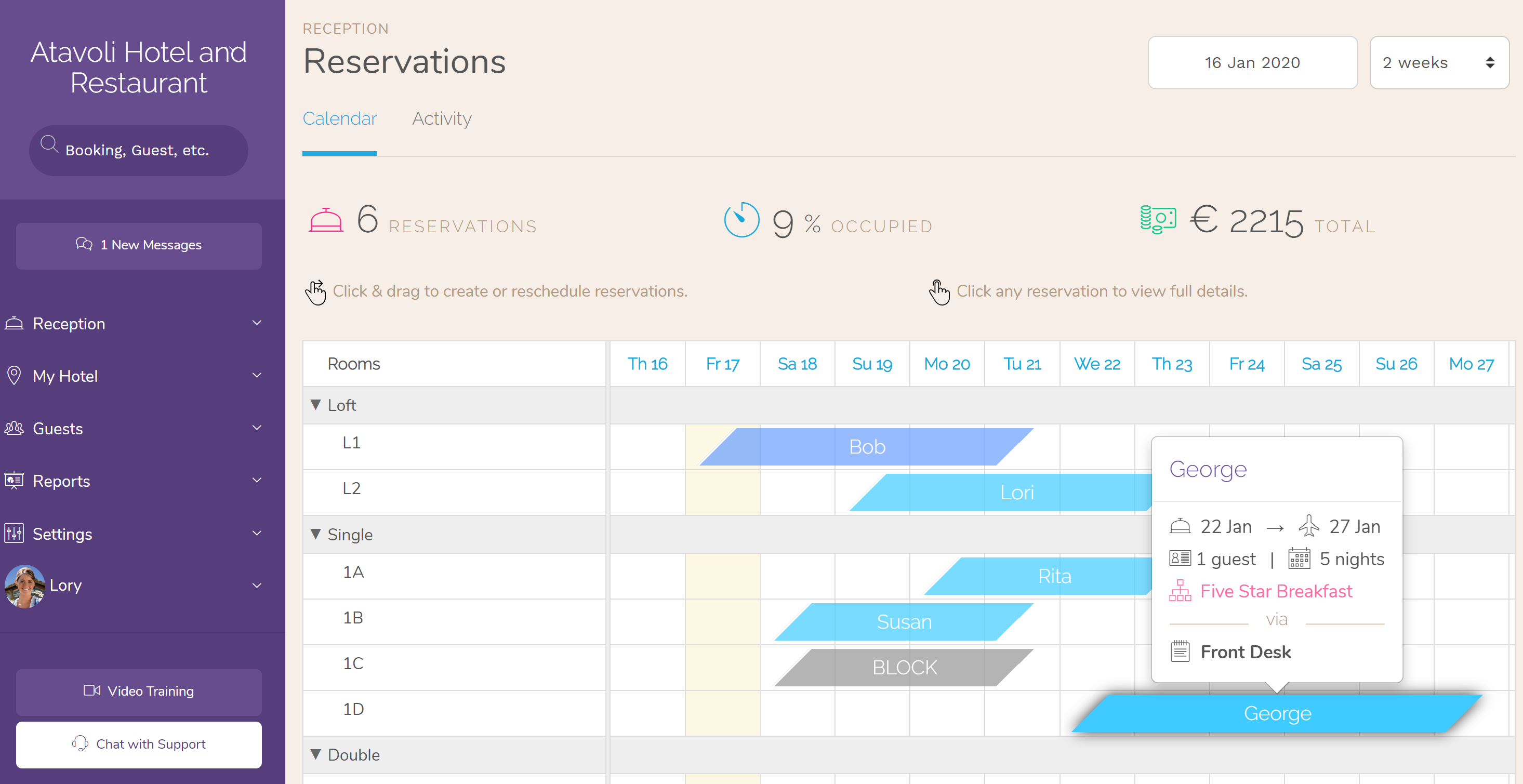
We have made a major release of our Front Desk and Booking Engine applications focused on improving user interaction. As our applications grow to meet your demands, so does the level of complexity in the menus and buttons. Our team fixed a number of inconsistencies across the application that made it difficult for both new and experienced users to get around.

Navigation
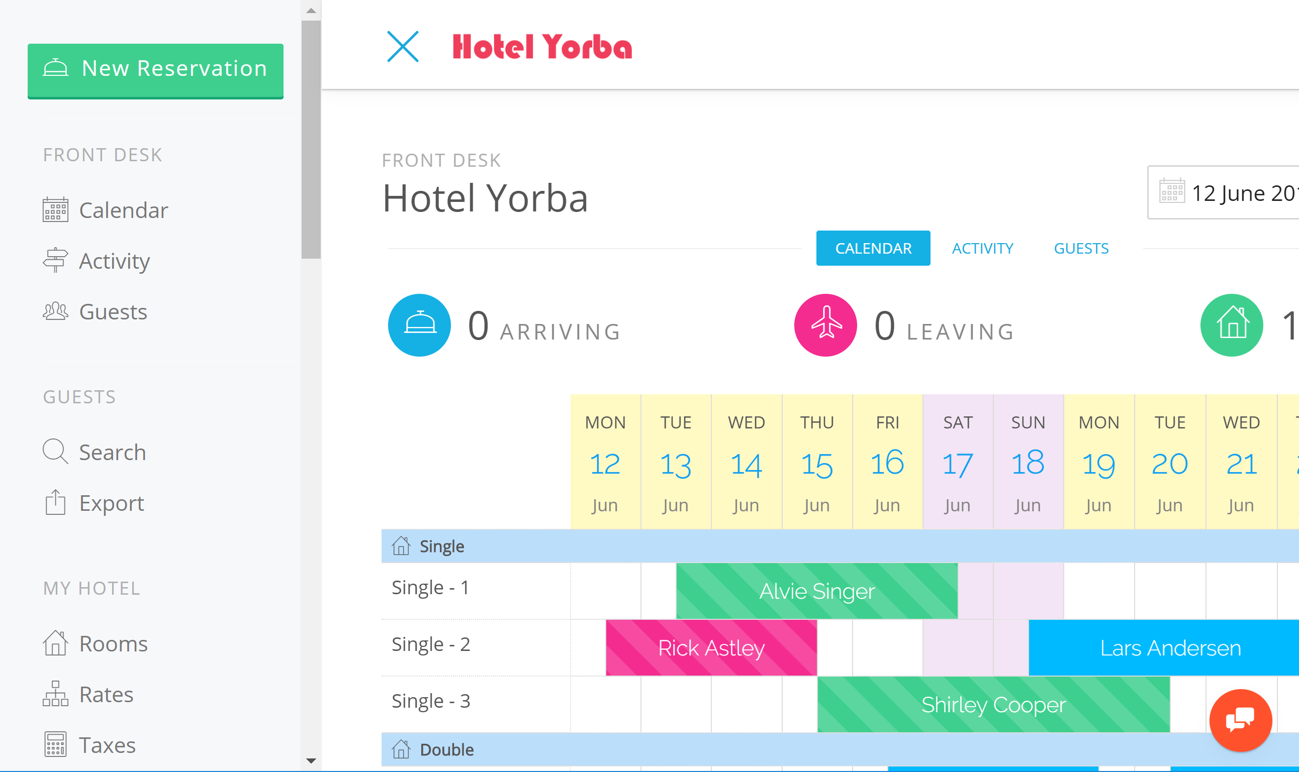
The biggest change you will notice is the new side navigation menu. Everything in the navigation bar, aside from your login info has moved offscreen into this new navbar. The problem with the old setup is that it often took more than one click to find an item. As more functionality was added, more titles were needed, which added up to a lot of superfluous clicks.

To get anywhere in the app now, just click the top left navigation menu (or ‘hamburger’) or swipe right if you’re on a smartphone. You have everything available to you in one list.
Reservations
The next major upgrade is to the Front Desk reservation process. Many users found the interactive calendar difficult to deal with, especially on smaller screens. We have moved the booking process into its own view. Click ‘New Reservation’ in the side menu, the select dates and guests, and you’re presented with all the available rooms and rates.
Detail Views
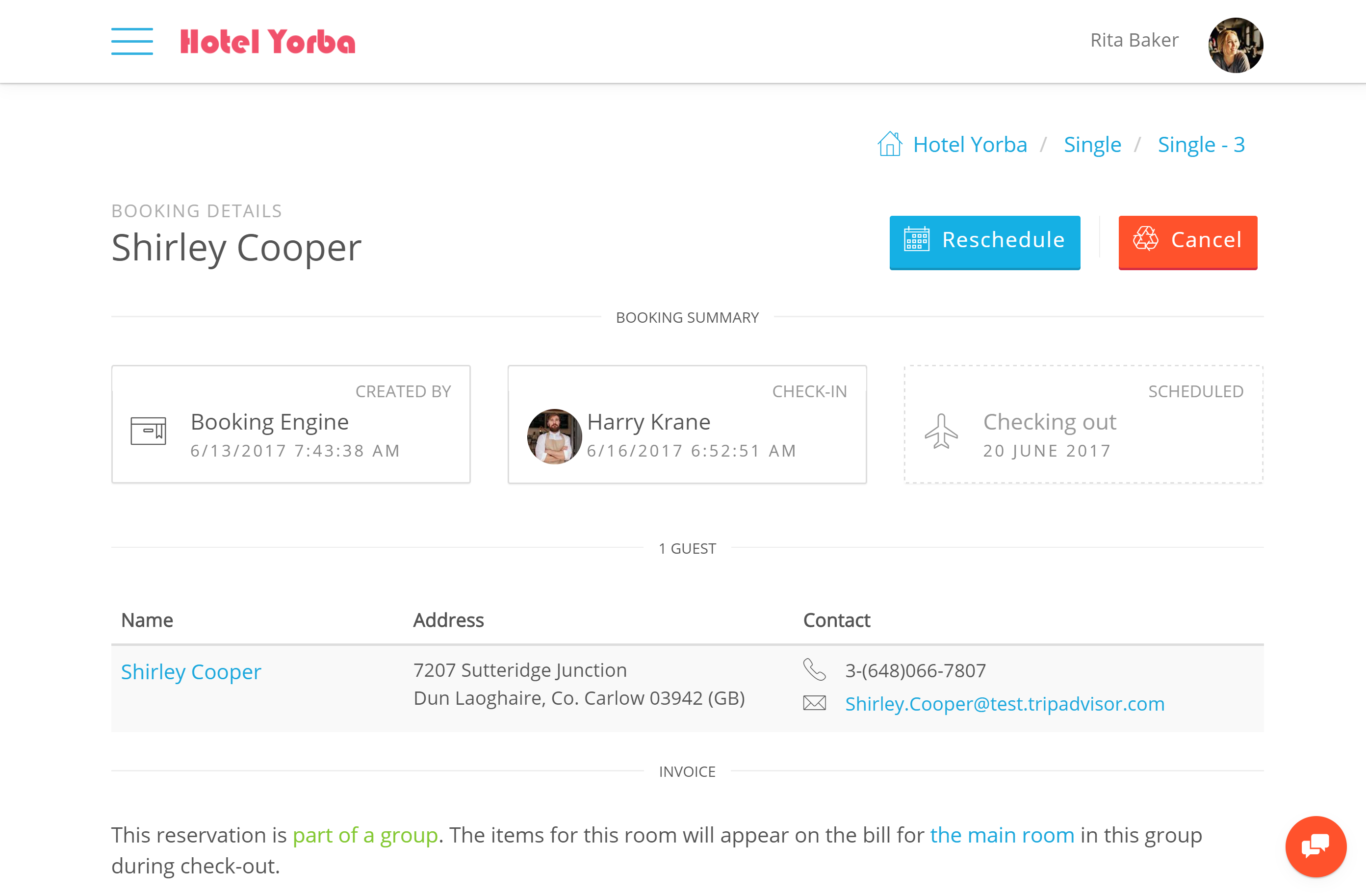
Another minor source of confusion was the reservation details view. We have dropped the 2-column displays in favor of a more traditional vertical layout, where your eyes move down the page. Warnings and notifications are yellow, and information is blue. For example, guests to be confirmed are found in their own notification card along with possible duplicates. Green has been reserved for payment information.

Booking Engine
The booking process has been shortened to 2 steps in the booking engine. Rates have been grouped with the room detail view, along with the reservation details. This makes it easier for the guest to find what they want without getting lost in too much information.
Consistency
Aside from this, many details have been sorted out, most notably dealing with language. Terms are used uniformly throughout, using as few words as possible to maintain clarity, as well as cutting out anything idiomatic.


