Booking Engine Style Updates
The booking engine has been updated to allow further customization, along with a revamped Cosmo theme. To explore what’s new, go to Channel Manager > My Booking Engine in the left navigation menu.
Brand Image
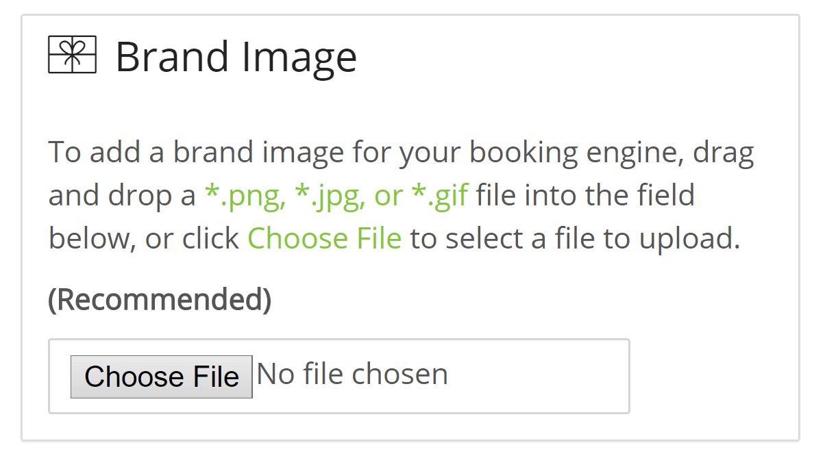
Up until now, there was one universal brand image that could be set for both the Front Desk and Booking Engine. With this update, you can now use a different brand image for your Booking Engine if you like. Just drop an image into the ‘Brand Image’ field to be displayed in your booking engine. If there’s no image set, it will default to the brand used in your Front Desk.

Additions to Styles
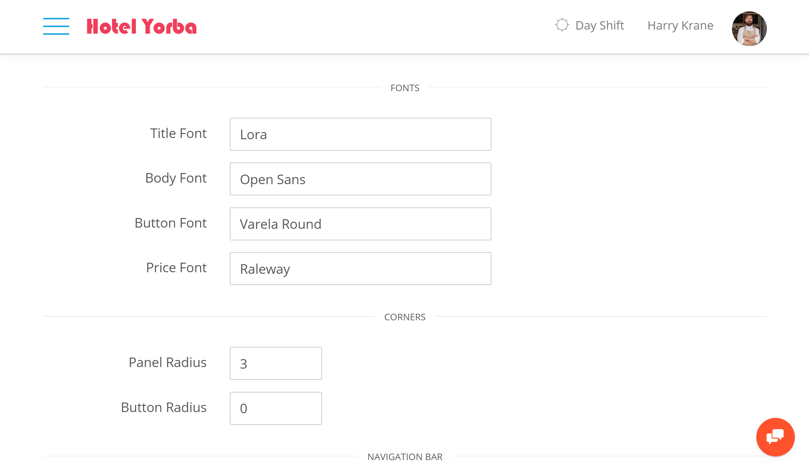
We have added fonts and button/panel settings to your Theme options. You can now set title, button, body and price fonts. Current users may notice slight changes to their existing sites, as all fonts are now set to ‘Open Sans’ as the default.

You can choose whatever fonts to use for each of these type of elements, but we recommend a readable body font. Feel free to explore with titles and buttons, but the main reading sections in your booking engine should be easy on the eyes for your potential guests. We recommend something along the lines of Open Sans or PT Sans for the body text. Merriweather also works nicely.
We recommend using Raleway for prices. It’s an OK font for titles as well, but we really like the unique layout that numbers have under the Raleway font.
Users can now set their button and panel corner radius. Some users tend to favor very rounded buttons or completely square buttons depending on their selected fonts. Serif fonts tend to look better next to square buttons and panels, while rounder Sans Serif fonts look better with rounder buttons.


Using the new features, users can match their previous layouts or go even further with new tools. To match your previous, stock layout, use the following settings:
- Title Font
- Varela Round
- Body Font
- Open Sans
- Button Font
- Open Sans
- Price Font
- Raleway
- Panel Radius
- 1
- Button Radius
- 2
Cosmo Theme
We have had two kinks in our booking engine themes up until now: the frequent use of a square brand image, and the Cosmo theme (in general). Both have been fixed in this update.

Up until now, our booking engine worked best with a brand image with a large aspect ratio (width/height), for use in the navigation bar. Brand images with an aspect ratio close to 1 (almost square) would end up looking squashed.
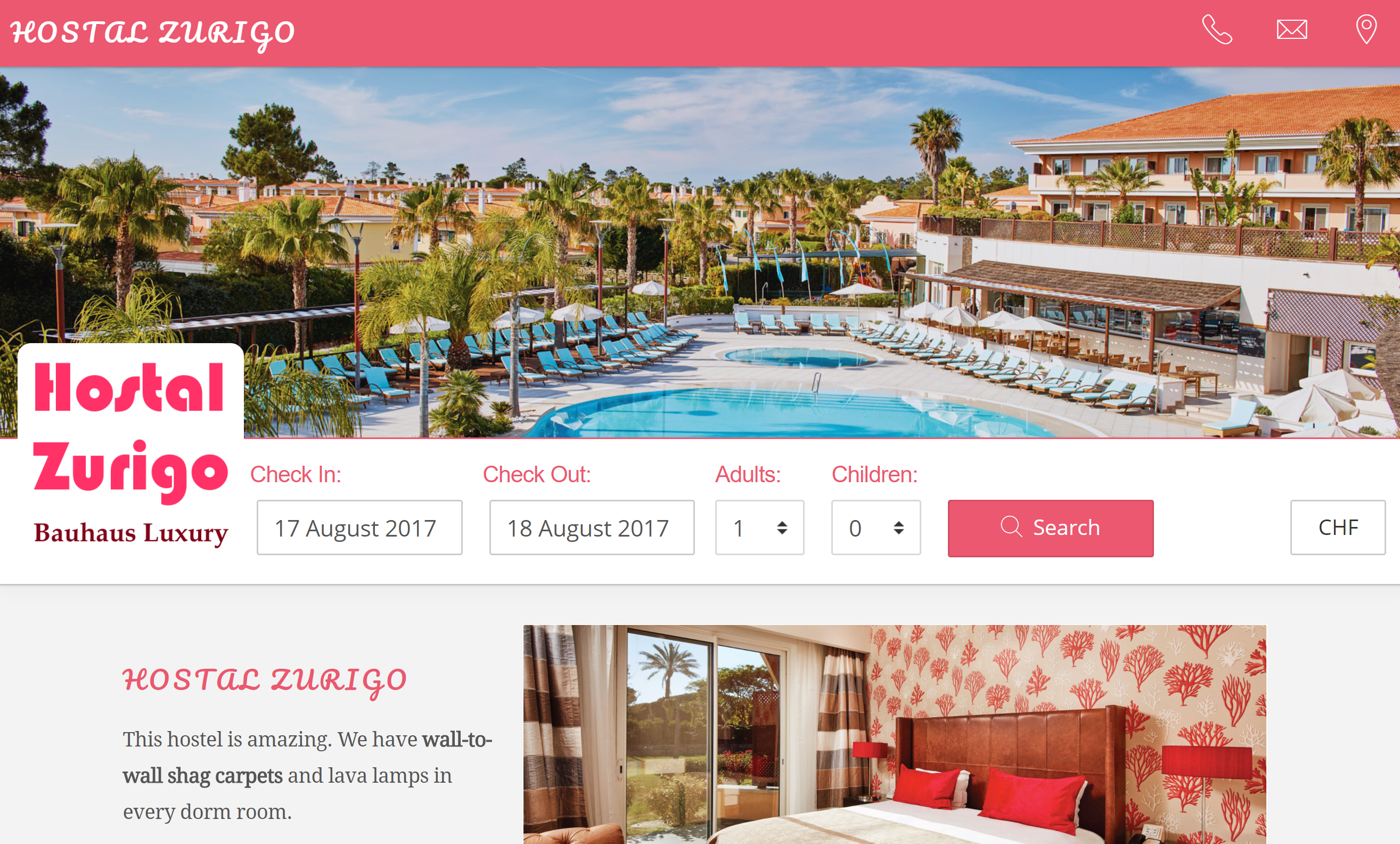
We have partly solved this problem in adding an option for a separate brand image to be used in the booking engine, but that wasn’t quite enough, so we revamped our Cosmo theme to accommodate the use of a square icon. Also, the two-panel layout has been reduced to one larger panel, making everything neat and even in a way that was not possible previously with this theme.
Recommendations
We recommend reading our earlier post on picking a color theme and generally not using too many colors. You want to match your booking engine to your brand, without making it look like a parrot (maybe if your hotel is tropically themed it’s OK). Play around with the options, but settle on something both attractive and easy on the eyes.
Use the Cosmo theme if you have a square brand icon, and we recommend using the Raleway font for prices. You’re free to pick, but we have found Raleway to be very effective in this case.
Enjoy the freedom in designing your booking engine! Use our three sample hotels (re., our home page) as a general guideline.


