Charts & Graphs
In our latest update to the Front Desk manager, we have added charts and graphs throughout the application to allow hoteliers to get an idea of booking sources and revenue distribution at a glance. There is no need to export your data to generate visual analysis of your hotel’s business.
Reservations
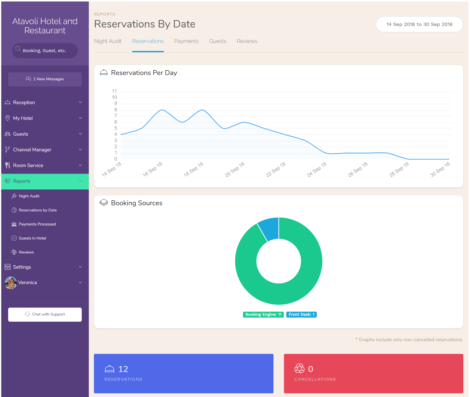
Go to ‘Reports > Reservations’ in the main menu, then select a data range to view the bookings that overlap the selected range. Click ‘search’ to bring up the results and their corresponding graphs.
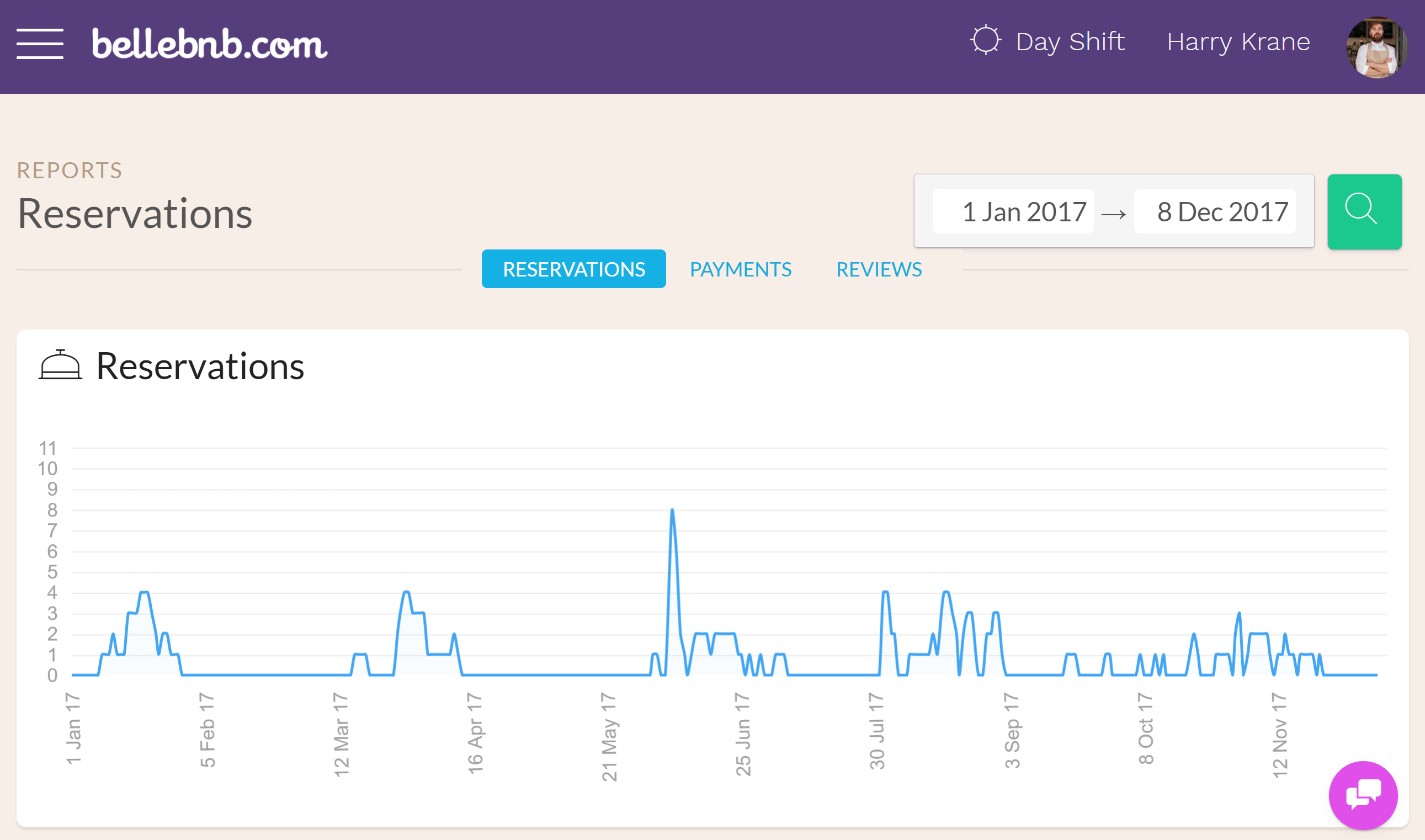
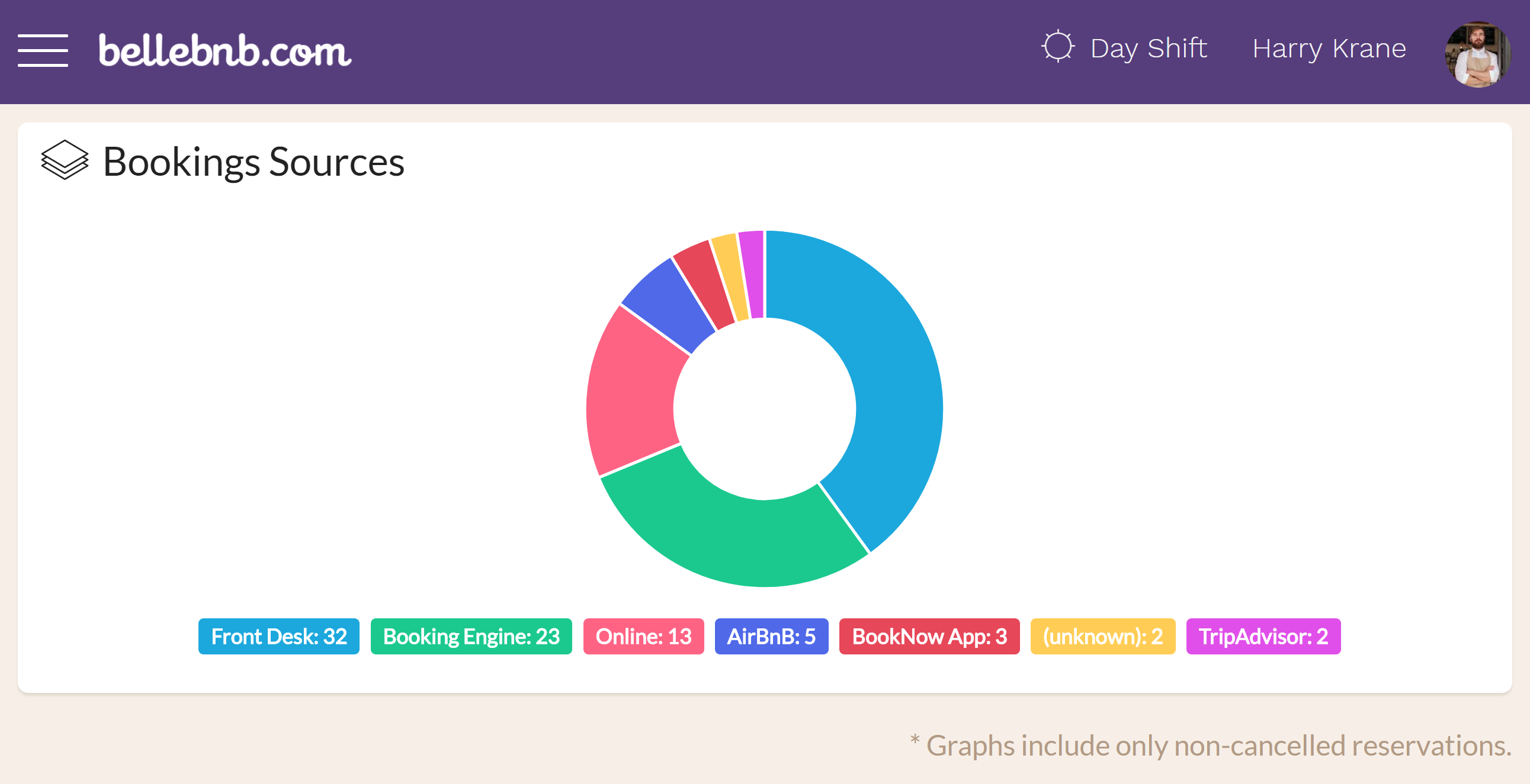
You have graphs for reservations by date, and reservations by volume per channel. Note that the graphs include only non-cancelled bookings. Cancelled bookings are included in the totals and export results below, but they don’t figure into the graphs.
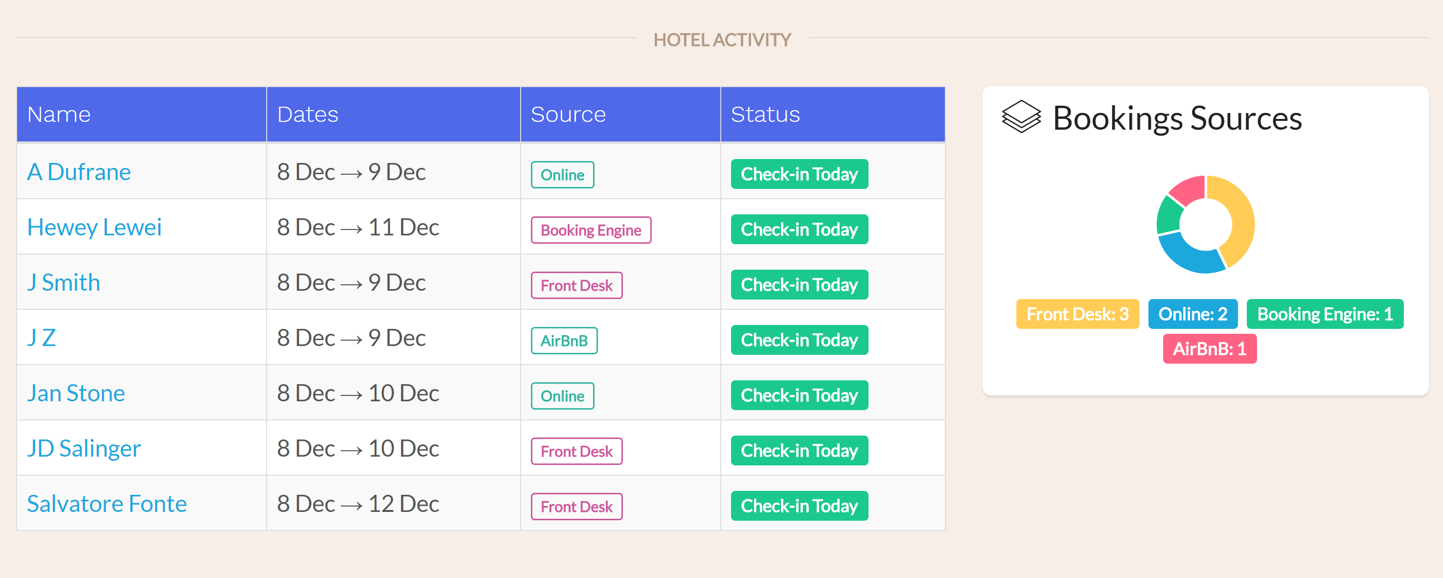
A booking-by-source breakdown is also available for the active reservations in your hotel. Check it out in your inbox, under ‘Front Desk > Hotel Activity’.
Revenue
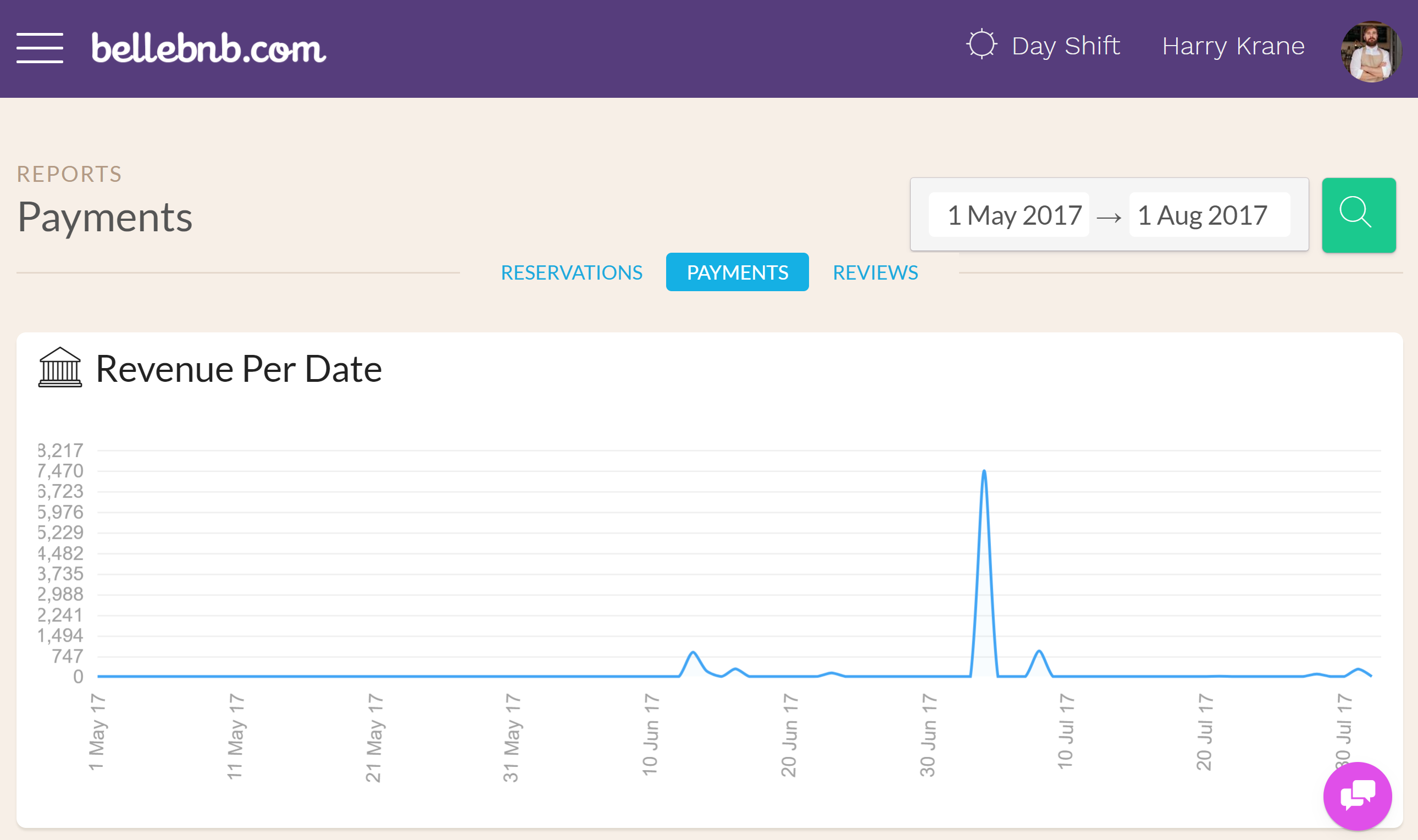
Next go to ‘Reports > Payments’ and select a date range to view the payments within the selected range. Click ‘search’ to bring up the results and charts.
An interesting graph to note is the ‘Revenue Per Source’ chart. Compare to the ‘Bookings Per Channel’ from the previous section to get an idea of your best-earning channels.
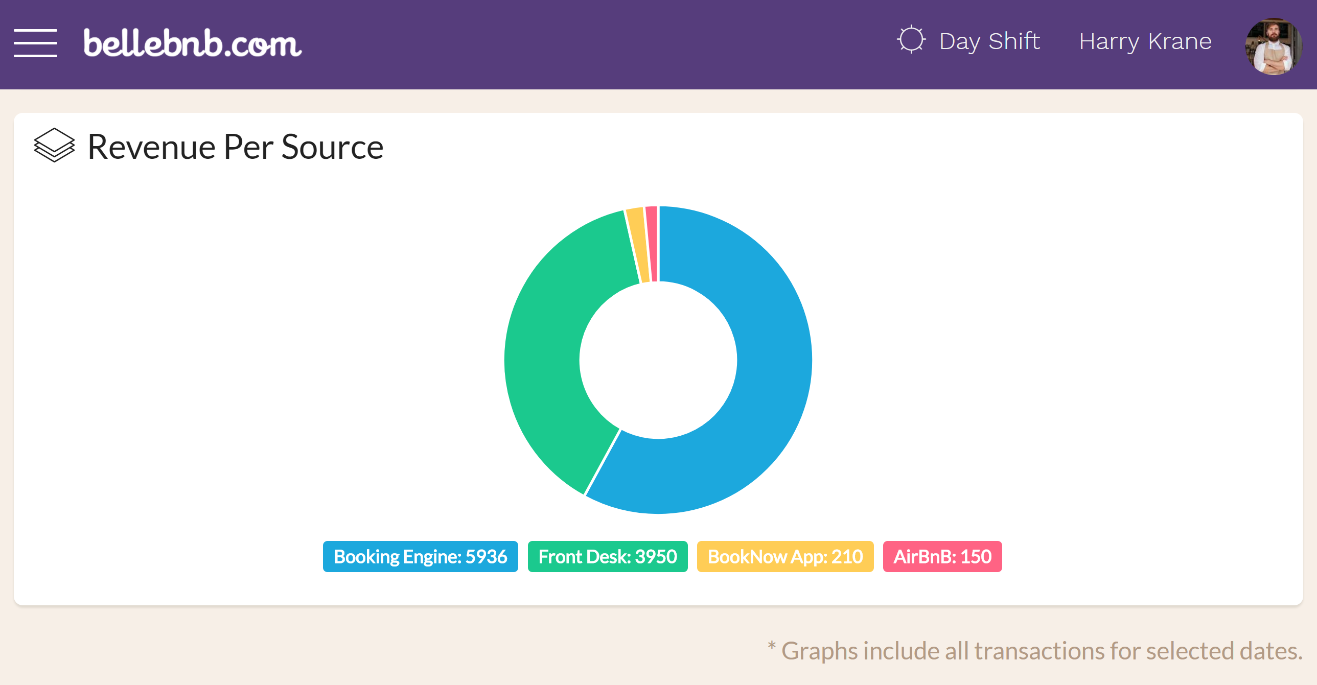
Note that the payments may or may not match up with booking/check-in/check-out dates for a reservation, and there may be more than one payment per booking. This is because payments may be spread over several transactions, like deposits, cancellation fees, etc.
Guests
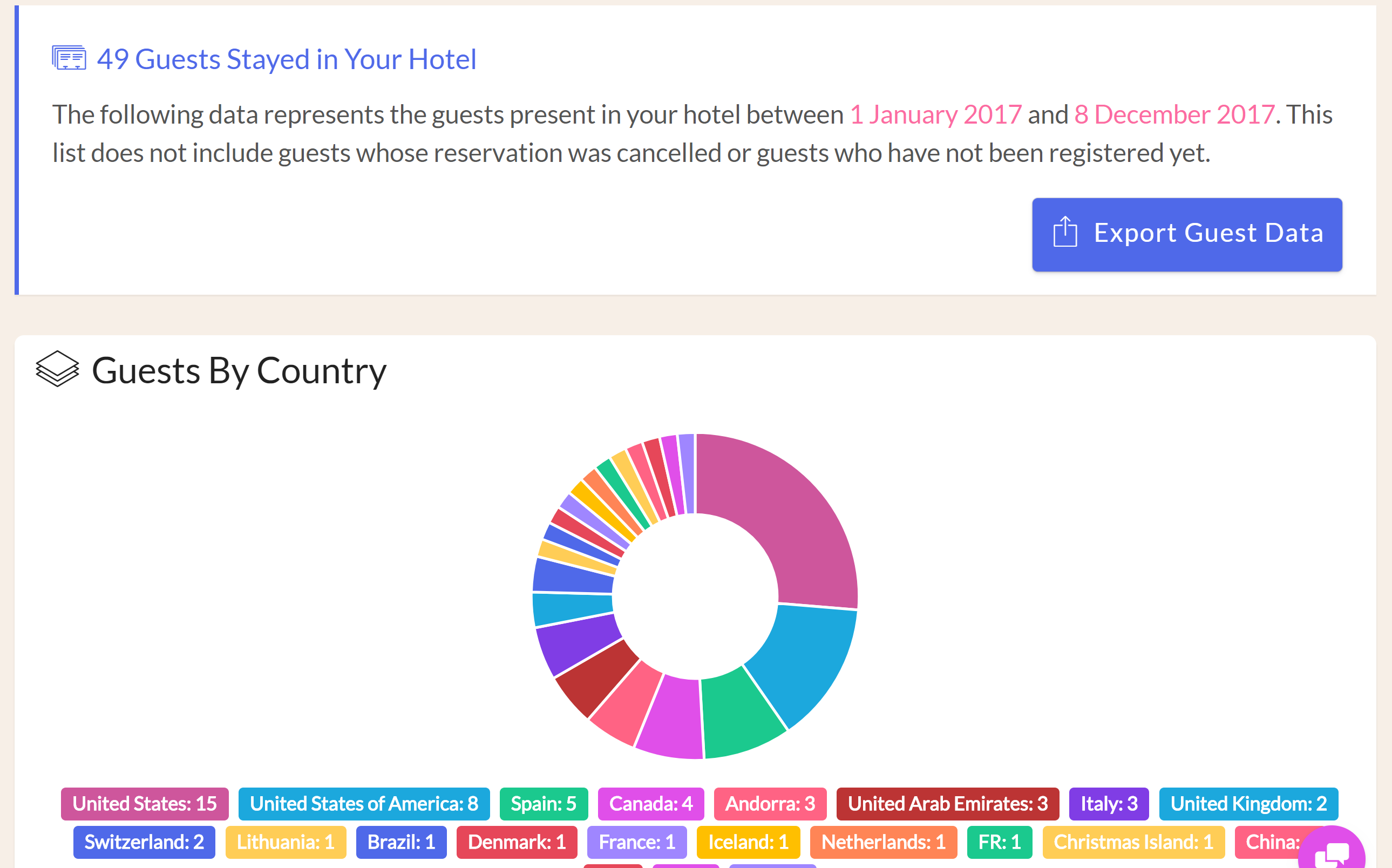
Next go to ‘Guests > Export Profiles’ and select a date range. Click ‘search’ to view the guests that were present in your hotel during this period, organized by country.
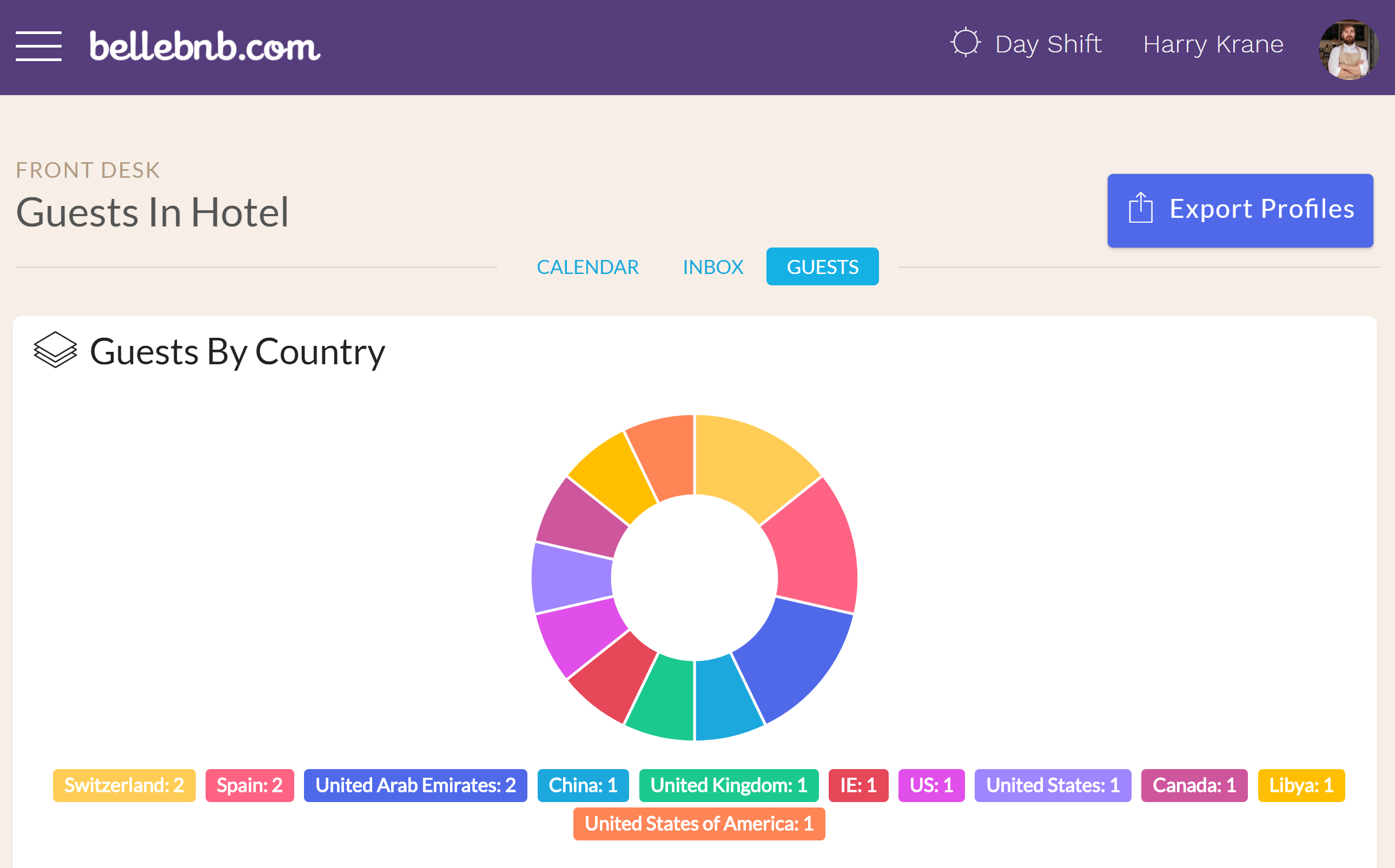
This graph is also available under ‘Front Desk > Guests in Hotel’. You can view guests by country for the guests currently checked in to your hotel.
Summary
You can get an overview of your hotel’s activity without leaving the Front Desk manager. All the important charts are available without having to export and dump into a spreadsheet.


